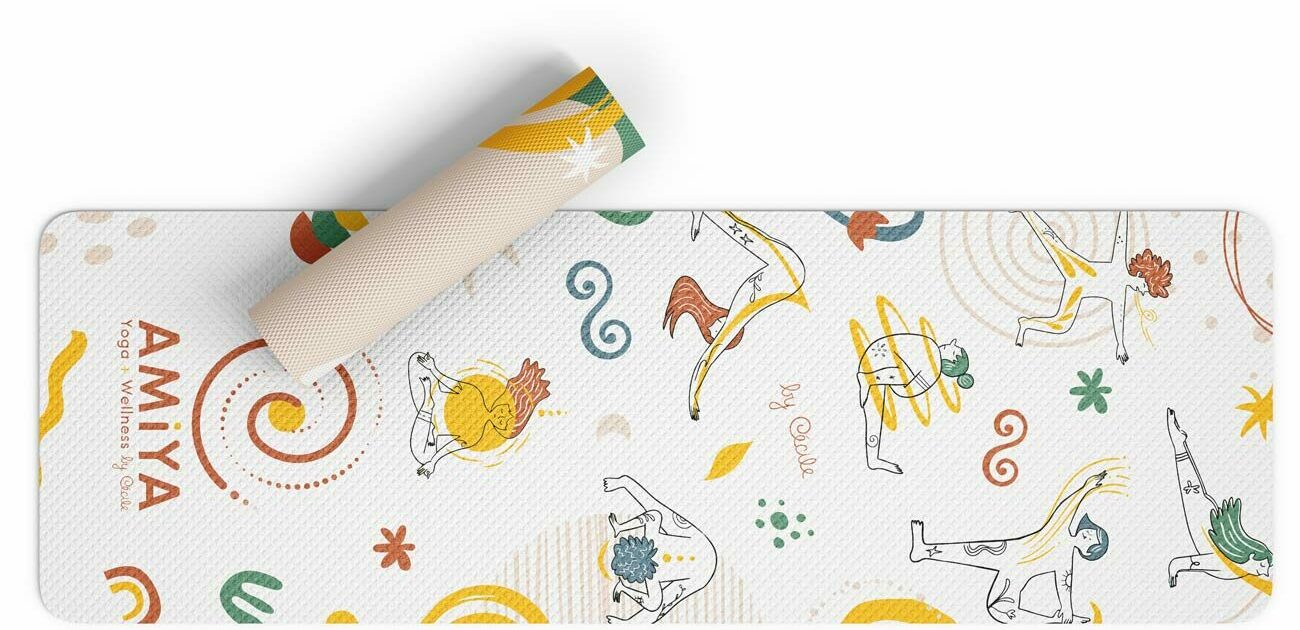
Amiya Yoga branding
Client: Amiya by Cécile
Branding, illustration, product design, print, webdesign

The BRIEF
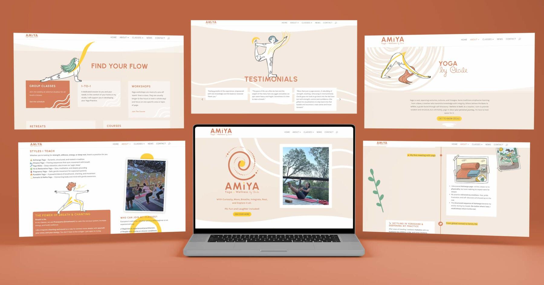
To help launch her new yoga classes and studio, Cécile needed a complete brand ecosystem, from logo and custom illustrations to merchandise, print collateral, and a website. This project holds a special place in my heart, as Cécile is a friend before she is a client. We had endless chats about her vision, ensuring the branding was rooted into her core values of joy, inclusivity, and celebrating imperfection.
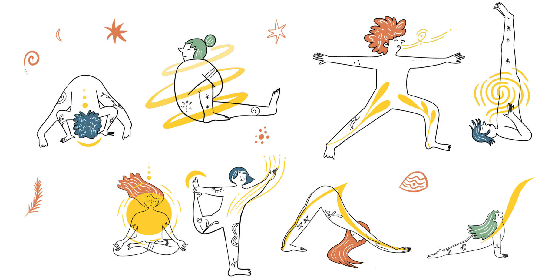

Solution
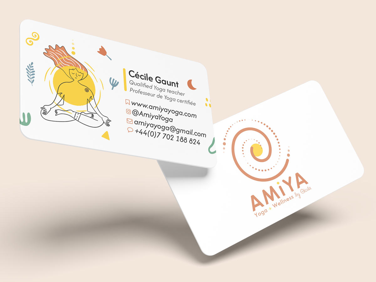
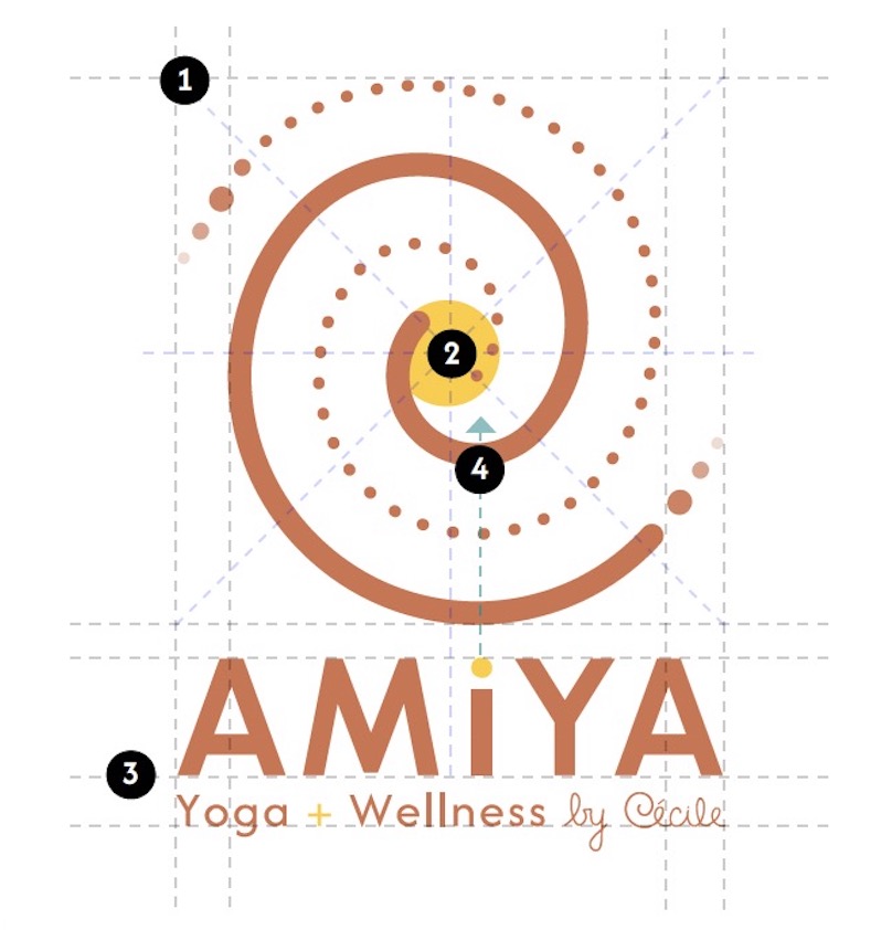
I designed a symbolic logo blending Cécile’s handwritten ‘C’, imperfect breathing dots, and a radiant core above the grounded "AMIYA" wordmark. Expressive character illustrations with vibrant yellow energy flows highlight the joy, breath, and inclusivity of yoga for every body. Using an elemental color palette (sun, earth, sea, trees, sand) and fluid abstract shapes, the identity spans across her communication materials, merchandise and web presence.
Anatomy of a logo
Click on the numbers for more details
Alternatives versions